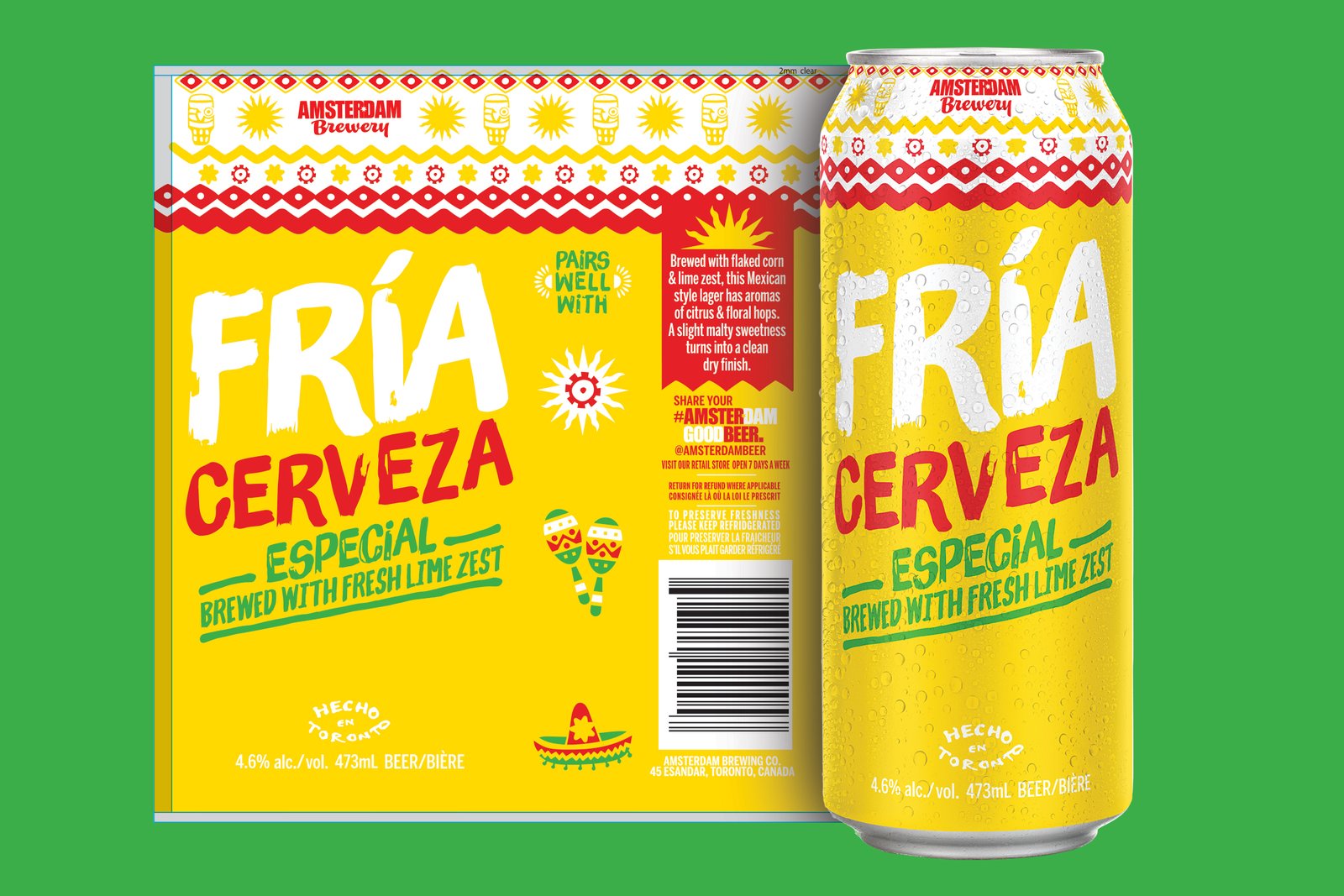
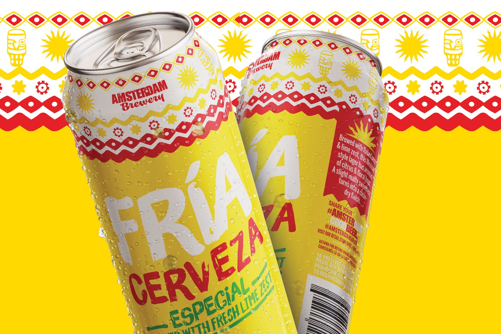
Fria Cerveza
Amsterdam Brewing Co.
Branding
Directed the design of a new product to hit shelves in late spring 2020. Managed and acted as the senior art director to develop the branding for an unreleased beer to enter the Mexican lager category of the Ontario craft beer market.
The Cerveza market tends to lean towards the "Corona" model. Bright yellows and blues to manifest the feelings of sun and surf. The challenge was to break the mould so to speak and create something engaging and fun while showcasing something different.

Using brighter tones of the reds and greens found in the Mexican flag made the perfect companion to the bright yellow hues of the beer and tied the additional influence of lime as an ingredient. Cheerful and attractive, the can design is lively and plays a subtle homage to the origin of the style of beer. A pattern rolls around the top of the can that mimics Mexican tapestries and the paint stroke typestyle makes the design approachable.