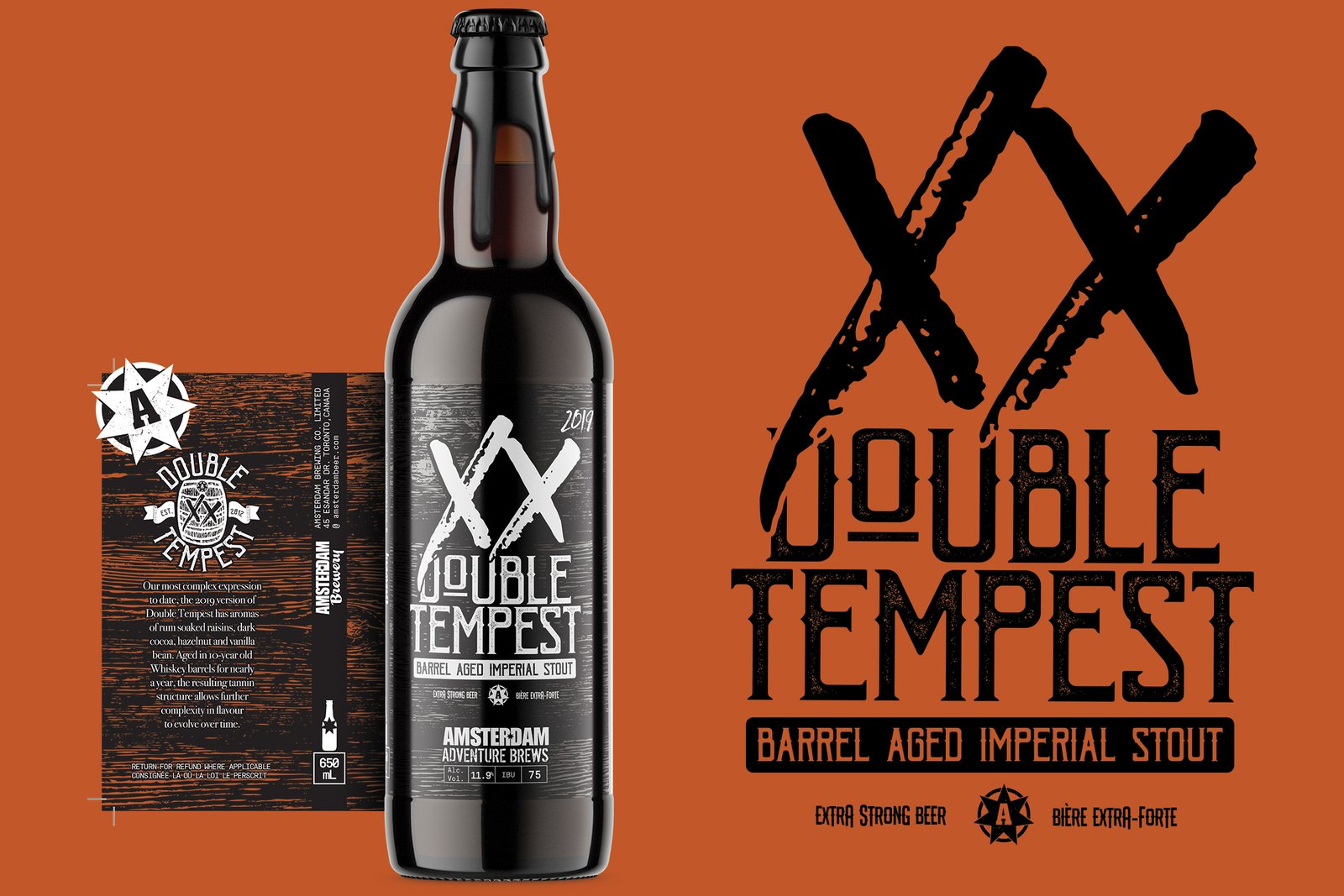
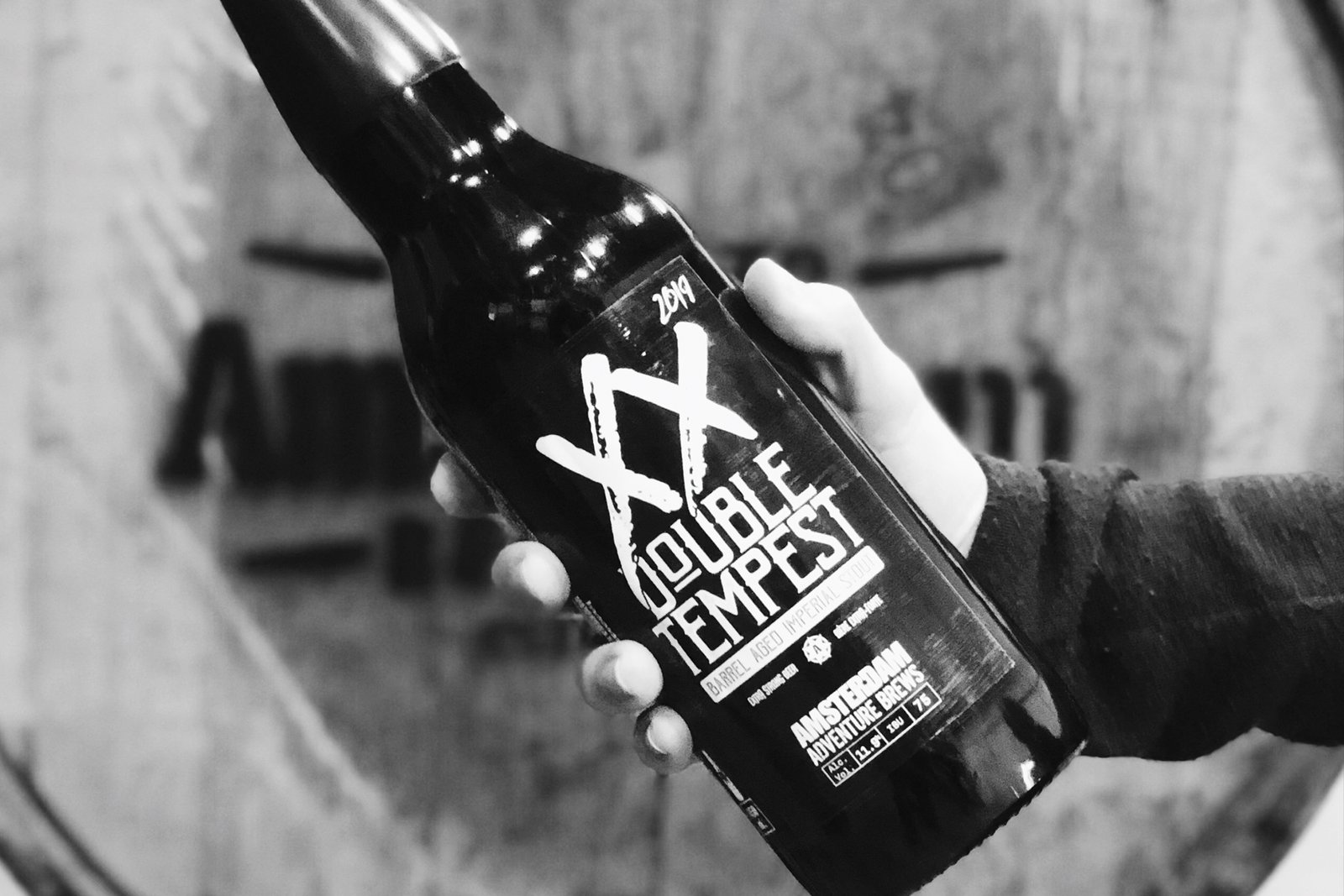
Double Tempest Barrel-Aged Imperial Stout
Amsterdam Brewing Co.
Label Design
Double Tempest has been a must for beer aficionados since it's inception in 2012.
We were tasked with redesigning the branding for the highly anticipated annual beer release in 2018 for the 2019 launch.
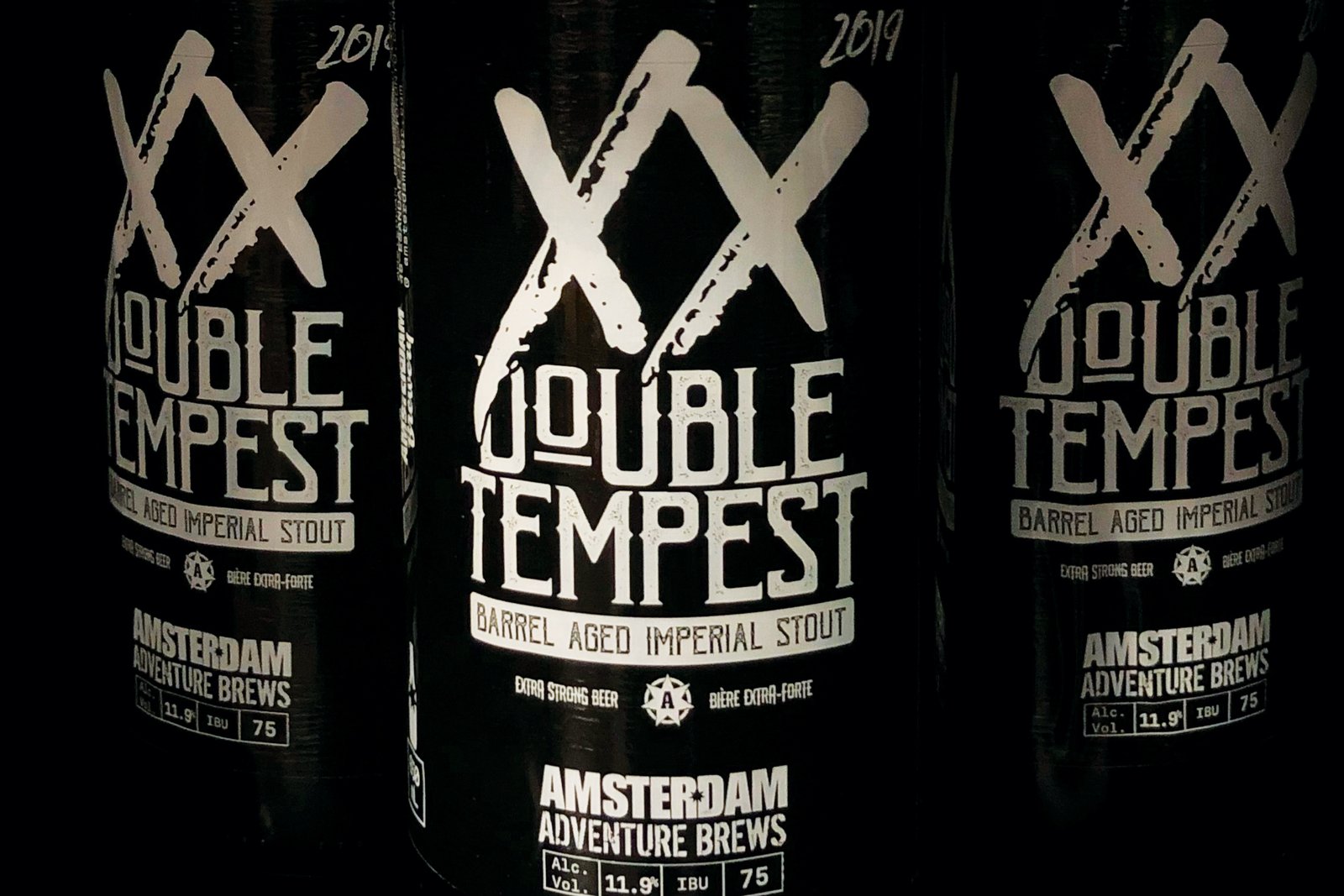
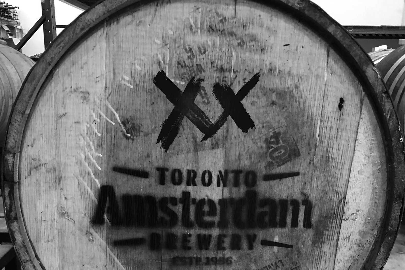
Taking inspiration from the brewing staff who always mark the used whiskey barrels that age the beer with two X's, the design revolves around the use of the 2 hand-painted letters with a nod to the rustic typography used in old whiskey and bourbon labels.
Since the beer is barrel aged, the label also incorporates the use of a woodgrain texture as a background. This grain was left inkless, so if the bottle was held in the correct way you could see the colour of the beer come through. - this might be bullshit, but we can fleash this out.