Ontario Smart Grid
Ontario Provincial Government
Identity
New technologies are a significant opportunity to make Ontario's electricity systems more efficient, reduce costs and give consumers more choice.
In the summer of 2016, we were tasked with creating the identity for one of these programs.
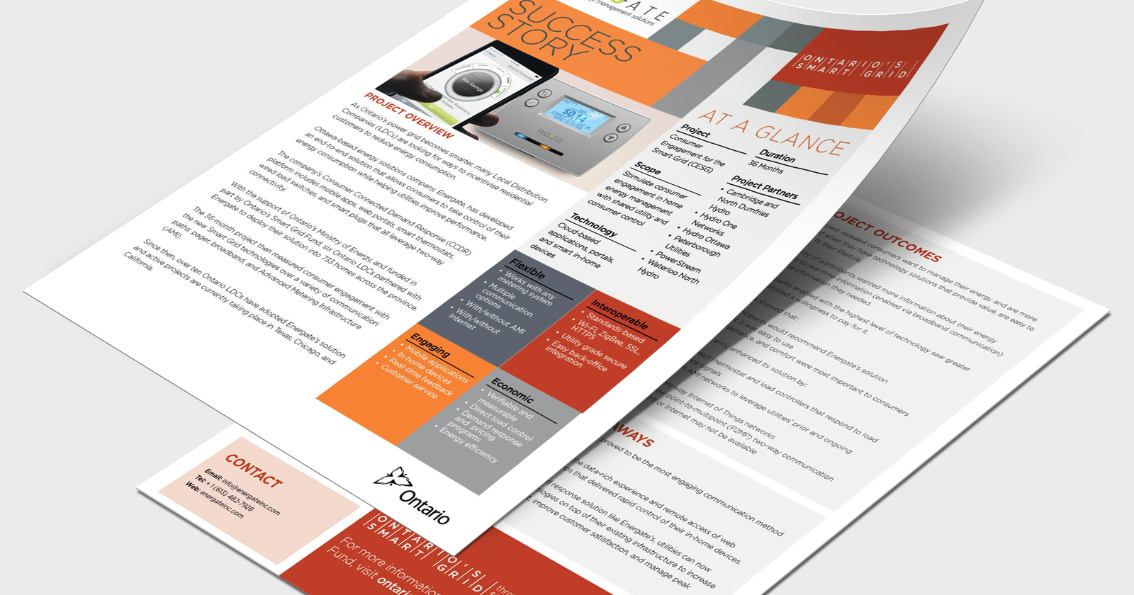
The Smart Grid Fund supports innovators to develop cutting-edge technologies that will make future systems run better and give customers more choice and control over their power use.
With strict guidelines around branding and building logos outside of the Ontario brand, we knew we had to come up with an identity that wouldnt alienate itself from the Ontario umbrella brand, but would also differentitate itself from the other programs in the same field.
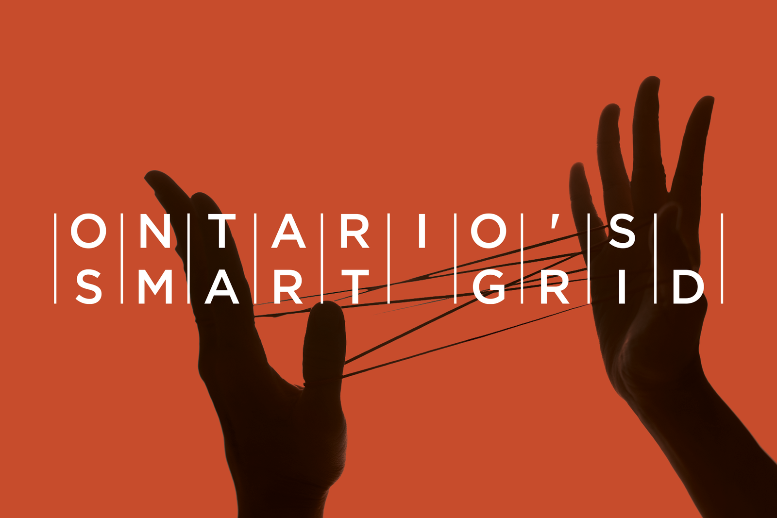
We started by breaking down what the idea of the smart grid to the most basic of idea. It is a more intuative way of seeing the transmission grid. It is the vehicle used to connect two points...
- The energy producers
- The energy consummers
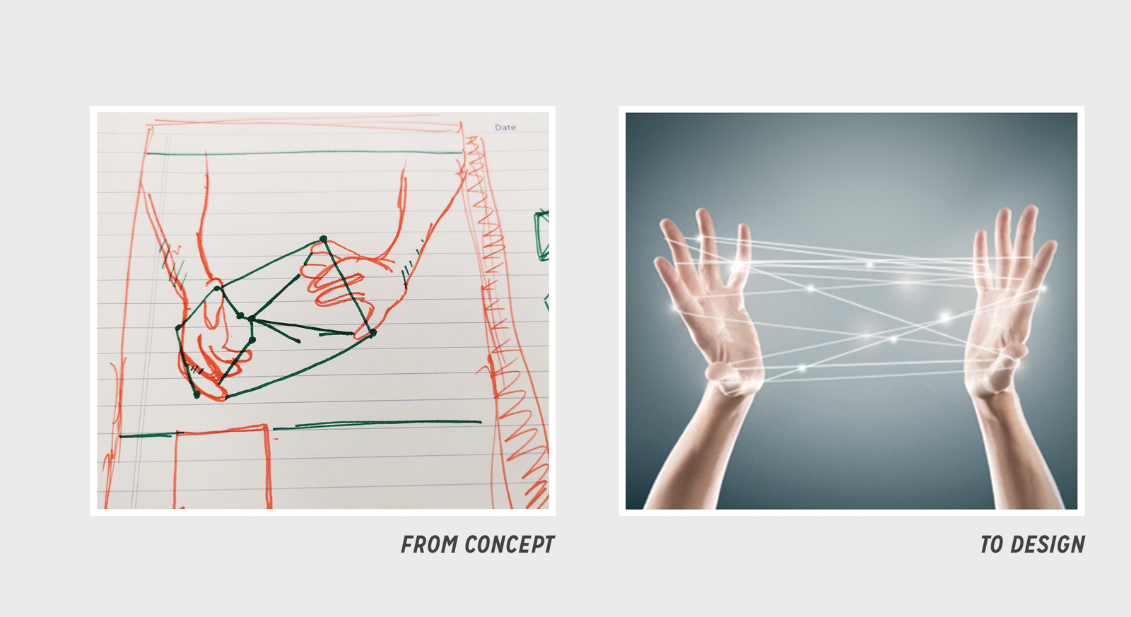
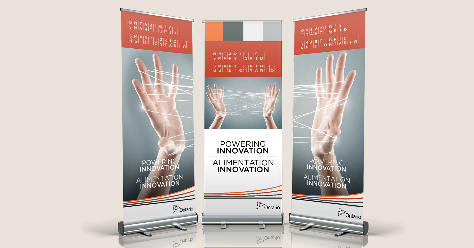
The solution decided upon was the cat's cradle. An image of a pair of hands being connected by energy laced threads. It added the needed human element to the complex idea of exchange between two points, the strings looked and could be seen as the power lines transfering energy and it allowed the end user to be both the designer and engineer of thier experience.